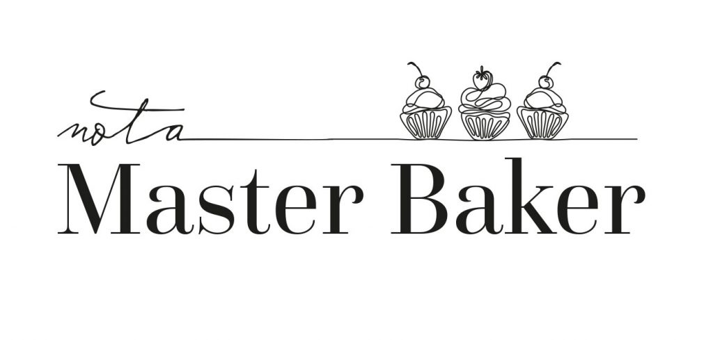
The name “Not a Master Baker” already strikes the perfect balance of classy and quirky – it’s self-aware, a little cheeky, and instantly memorable. Thats the energy I pulled into the process while designing their logo ….
Not a Master Baker is a small independent bakery based in Doncaster, known for its delicious handmade bakes and down-to-earth personality.
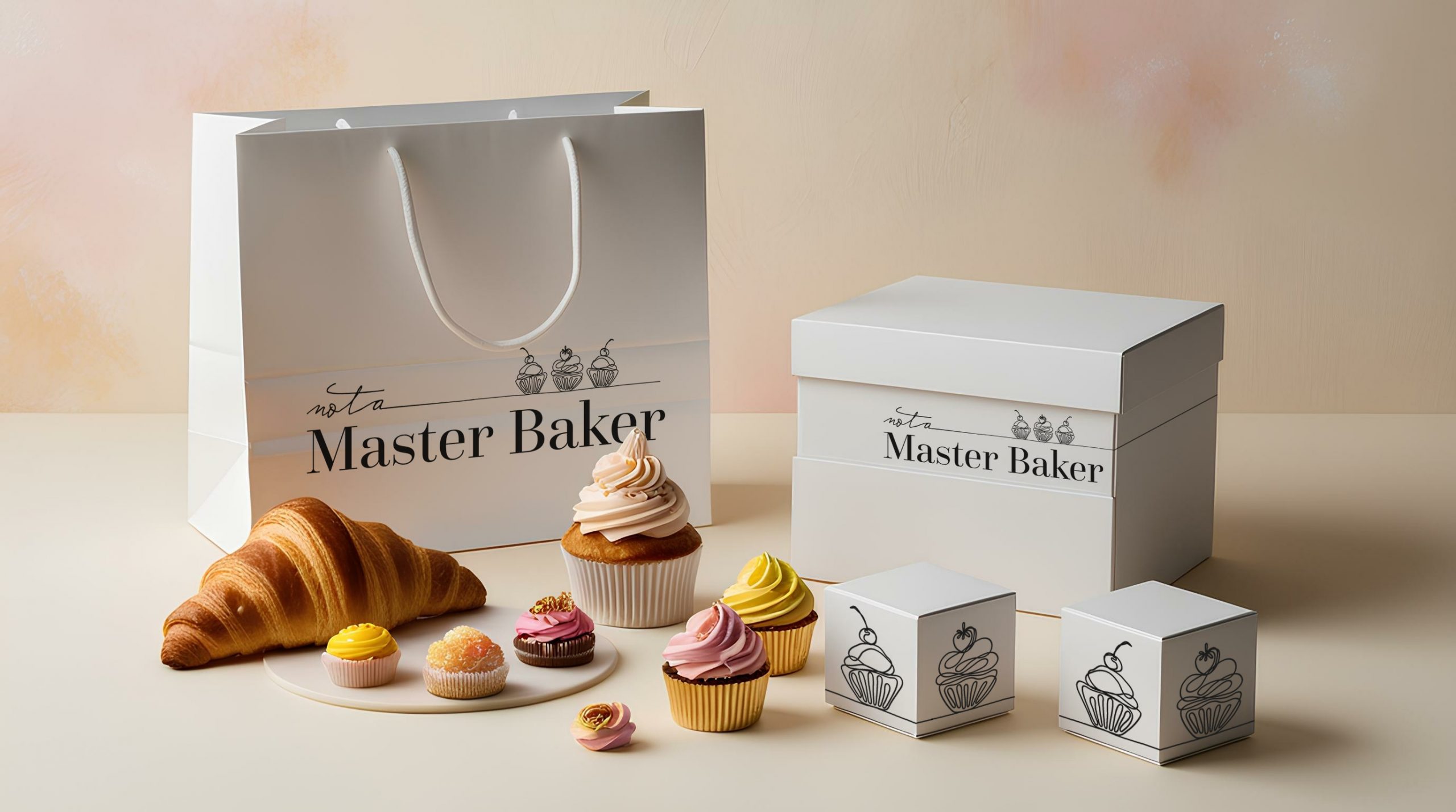
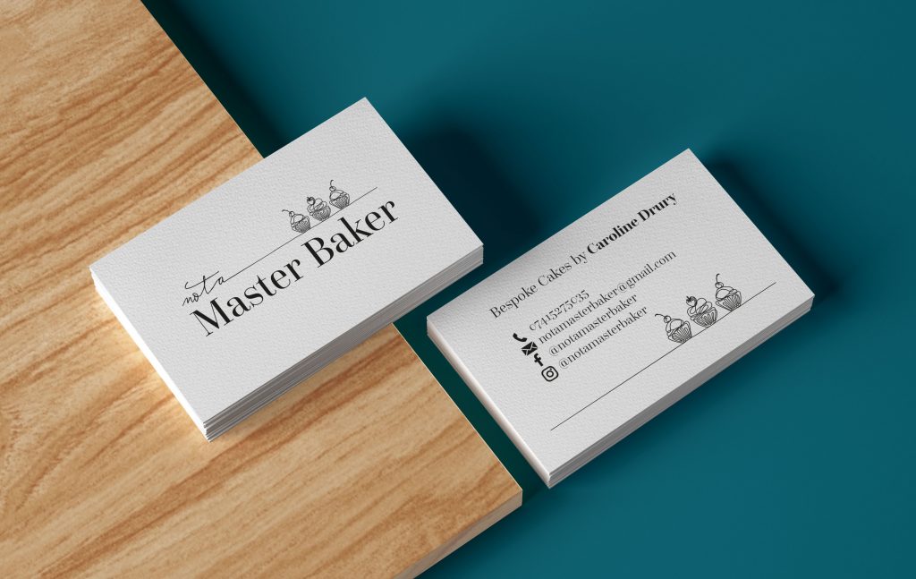
The brief was to create a logo that felt fun, approachable, and instantly recognisable, while remaining practical and easy to reproduce across a variety of print and packaging applications. The focus was on developing a clean, simple identity that complemented the brand without overpowering it—allowing the products to take centre stage, with the logo acting as the icing on the cake.
The result is a versatile and memorable mark that captures the bakery’s character while providing a strong foundation for future brand growth.